


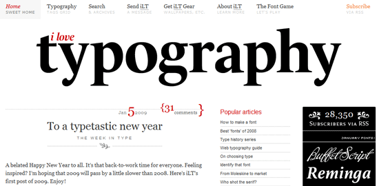
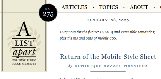
huruf yang memiliki tingkat legibility (kejelasan) dan readibility(keterbacaan) yang baik, bisa mengesankan si empunya web. Bisa juga huruf di mainkan menjadi image atau permainan visual saja. aspek layout, pemilihan warna, penciptaan bentuk, garis, dan pemilihan gambar, gaya desain web, itu juga akan mempengaruhi ke tepatan dan keindahan tampilan web. artinya semua elemen tadi sebaiknya imbang dan serasi...namunkadang-kadang huruf lah yang paling bernasib sial, di abaikan dalam membuat desain web, karena ke engganan mengolah jenis-jenis atau terlalu banyak huruf jadi pusing milihnya hehehhe....
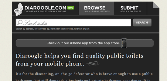
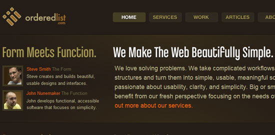
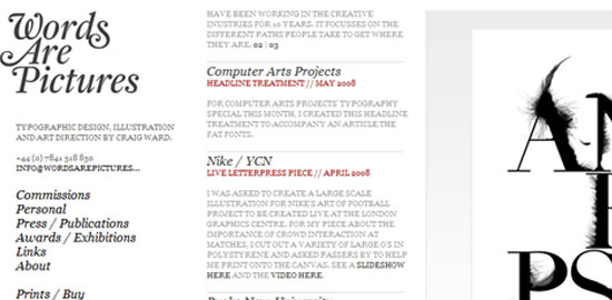
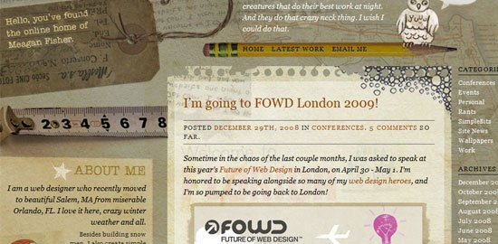
INI gan ada 20 web yang mengunakan huruf terbaik..cekidot gan..
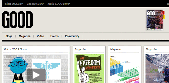
Spoiler for 1:

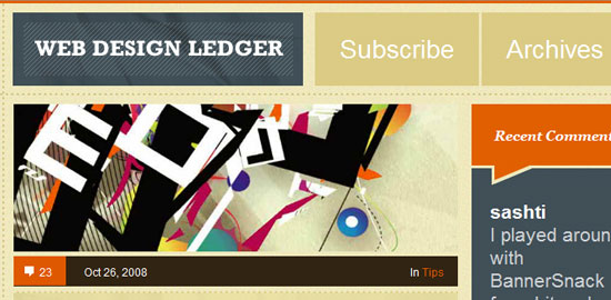
Spoiler for 2:

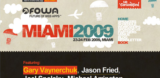
Spoiler for 3:
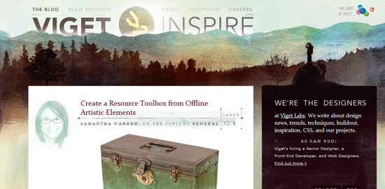
Spoiler for 4:
Spoiler for 5:
Spoiler for 6:
Spoiler for 7:
Spoiler for 8:

Spoiler for 9:
Spoiler for 10:
Spoiler for 11:
Spoiler for 12:
Spoiler for 13:
Spoiler for 14:

Spoiler for 15:

Spoiler for 16:
Spoiler for 17:
Spoiler for 18:
Spoiler for 19:
Spoiler for 20:


0 Komentar:
Posting Komentar
Mau berkomentar??,jangan malu!! yang penting NO SPAM,NO PORN! Ada pepatah lo "Malu berkomentar sesat di blog ini !!hehe"!,hanya bercanda!,klik di sini untuk mengetahui cara berkomentar yang benar!!,blog menarik tidak lagi melakukan tukeran link!,mohon maaf,dan bagi anda yang sudah memasang link/banner saya di blog sobat,mohon di hapus saja!,karena saya juga menghapusnya!,terimakasih!!